- Art directorPosition
- ConfidentialClient
- PhotoshopTechnologie
Brief
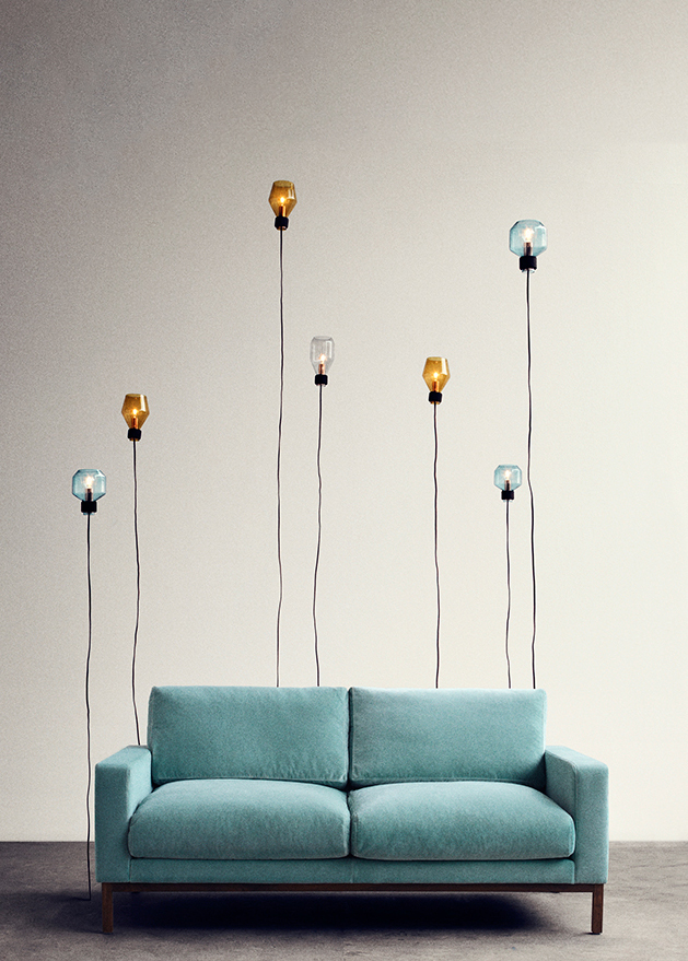
Nordicsofa is an ecommerce website selling scandinavian sofas design fully customisable.
- Adapt the design on tablet devices.
- Creation of new homepage banners weekly.
- Creation a new design for the product page.
- Lead the design team and organise the general planning.
- Design and approve the form after integration of the newsletter.
Idea
- Increase sales by helping the customer to get all the informations easily, and create new design focusing on the user experience by modifying the product page.
- Balancing the style of the design with the theme of the event, we bear in mind to stay in a scandinavian style.
Technologies
- HTML
- CSS
- Photoshop
- Illustrator
Chart color
-
#73b88e
-
#ffffff
-
#000000
Responsive
We adapted the website on tablet devices.
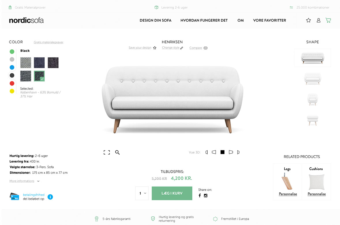
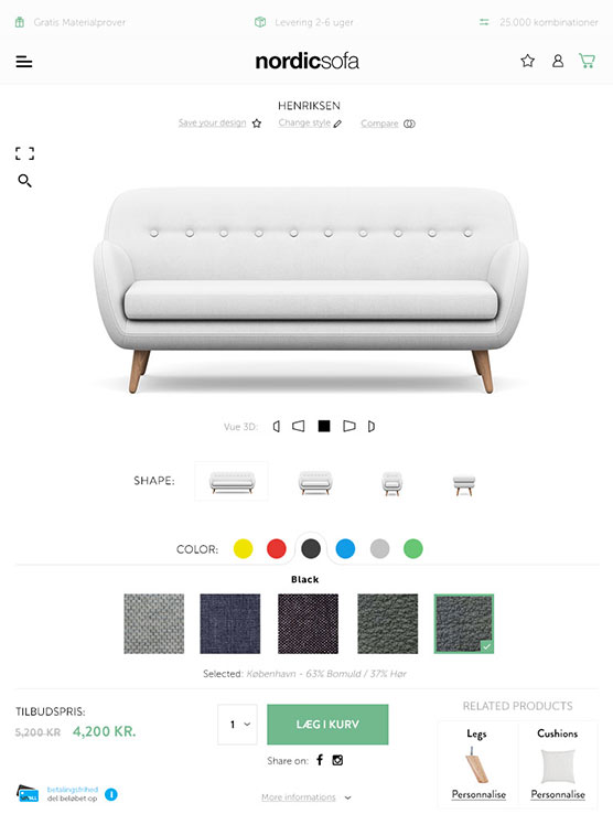
Product page
The design was created for a more modern and neat approach to give customers a satisfying experience, by avoiding the trouble of scrolling the page to get more informations.
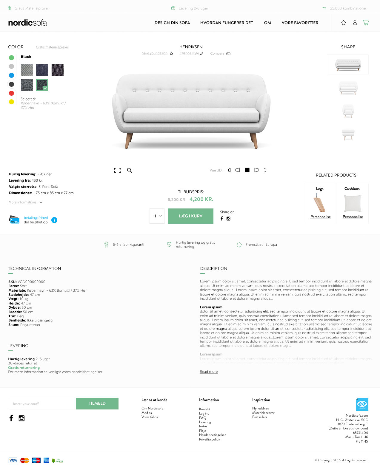
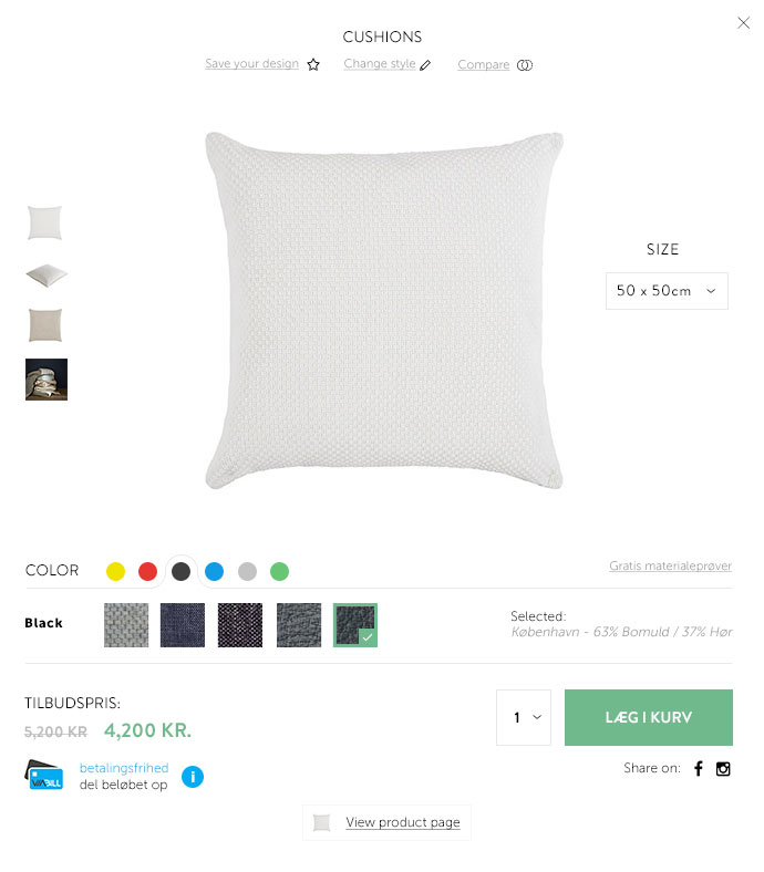
Popin Related products
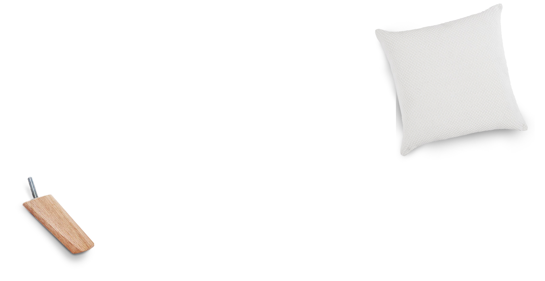
We keep the customer on the product page and when he click on the related products section, without any reloading page, there is a popin appear where there is everything needed to order his product.
Home page banner
I lead the design team for the creation of the home page banners for each events weekly.

- Art directorPosition
- Maxim'sClient
- Photoshop IllustratorTechnologie
Brief
Maxims it's a renowned chain restaurant from Paris.
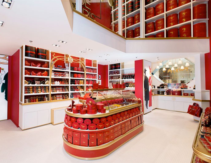
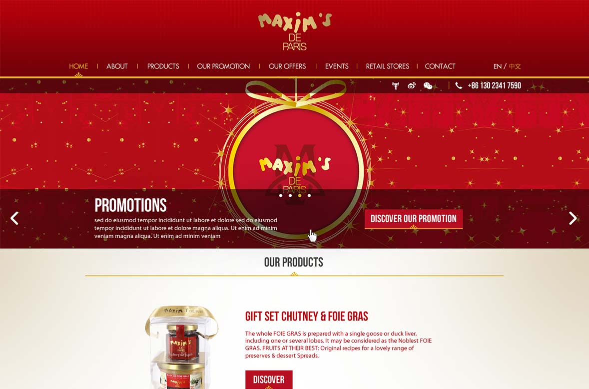
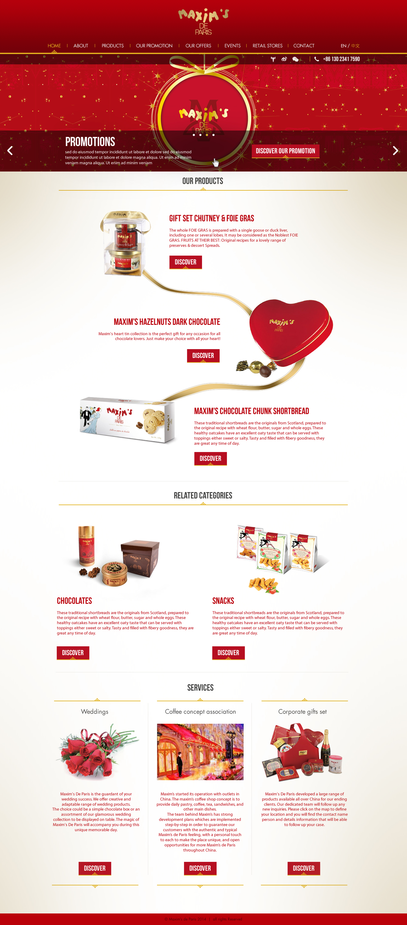
- Create a new home page design.
Idea
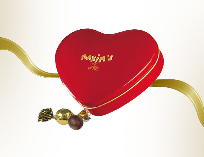
Attract the maximum of customers while respecting the corporate identity.
Technologies
- Photoshop
- Illustrator
Chart color
-
#b60e21
-
#f9d48c
-
#1a1a1a
-
#ffffff
Preview
Inspecting the fold, we can see a slider for the main promotions and some visible informations below, to get the customers to do a natural action of scrolling.

Homepage

- Art directorPosition
- Les petitesClient
- PhotoshopTechnologie
Brief
French ecommerce website focus on selling trendy clothing and accessories.
- Redesign the category page.
- Redesign the home page.
- Redesign the checkout pages.
- Everything made in the measure of responsive design.
Idea
- Create a design by following my clients' specific demands.
- Propose new ideas to increase the sales by changing the design and simplify the procedure of the checkout pages.
Technologies
- Photoshop
- HTML
- CSS
Meanwhile, I got opportunity to help on the code.
Chart color
-
#b60e21
-
#f9d48c
-
#ffffff
Preview
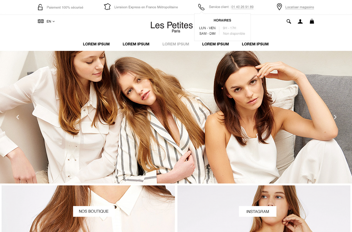
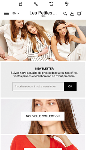
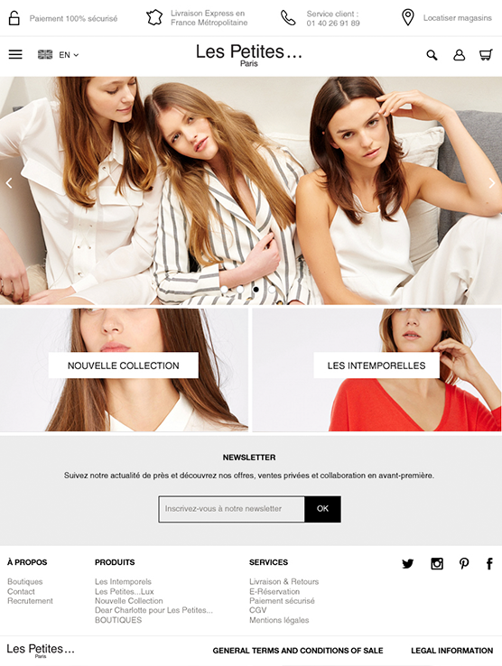
Exemplary of the home page in responsive design.
Home page
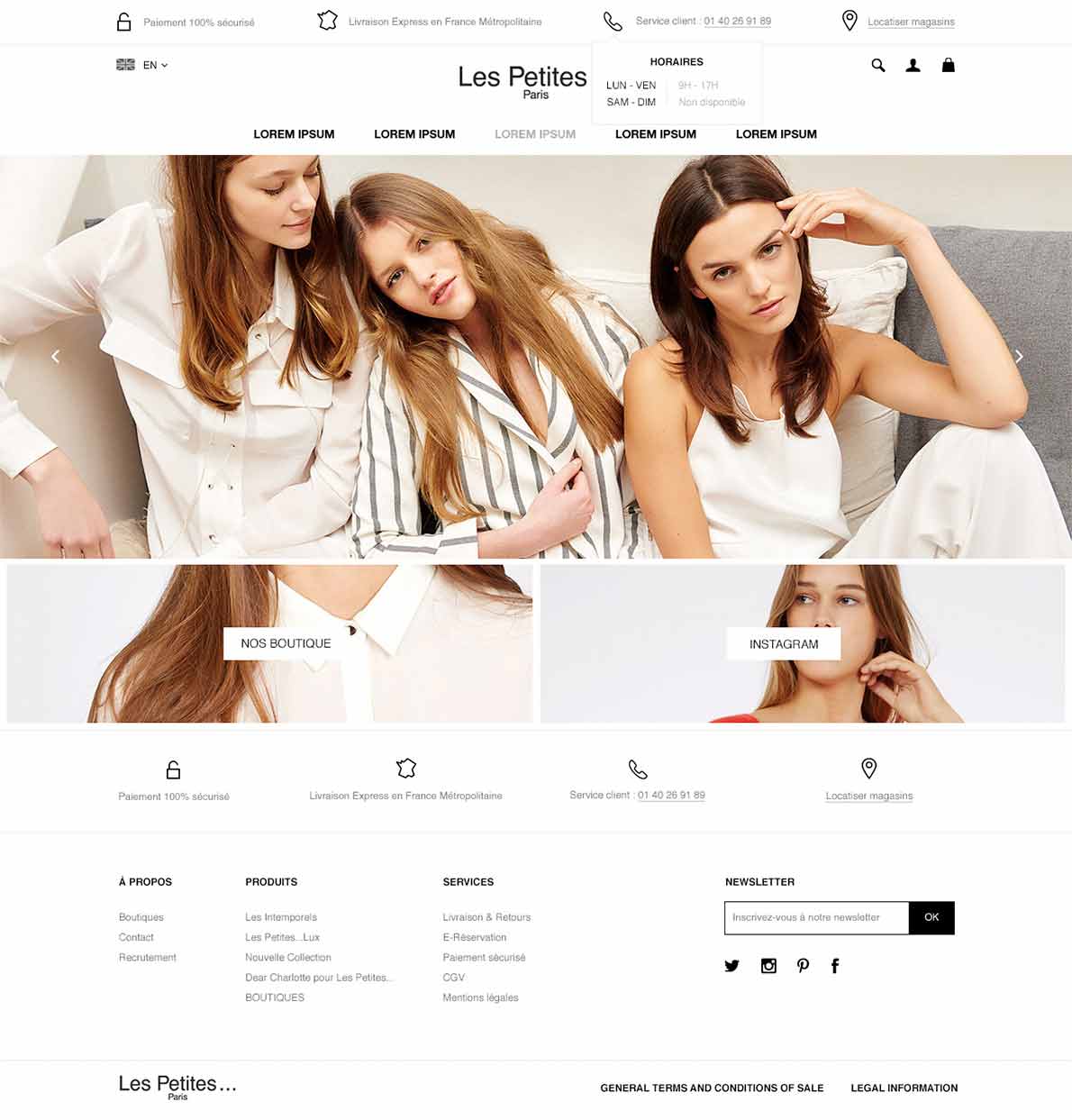
Creation of a big banner (the main promotion) follow by two other blocks to guide the customer to go on some categories or others promotions. Everything has to be visible for the customer when the page is loaded.
Category page
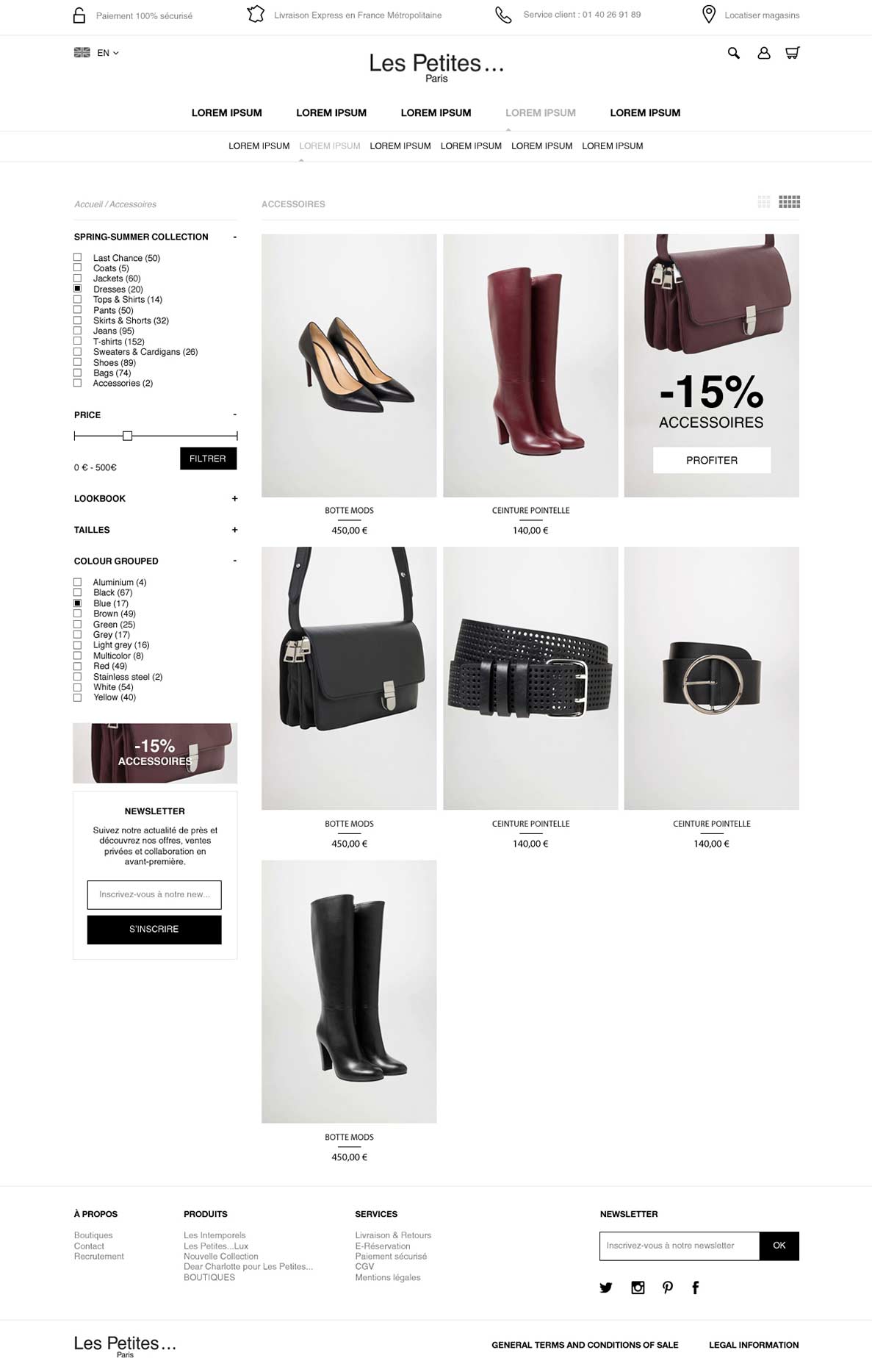
We give the possibilities to the customers to change the grid to see more products in once. There are ads injected among products increasing the chance for customers to be involved in the promotion. And on the side bar, there is a block for the customers to subscribe the newsletters.
Checkout page
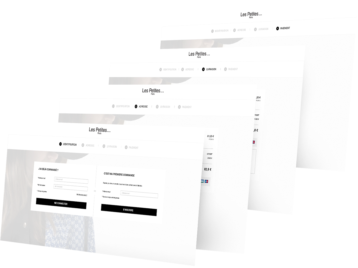
The main goal of the checkout is to guide the customer to order his products more effectively by proposing an improved UX.
- Art director - Senior Front end developerPosition
- ConfidentialClient
- HTML, CSS, Photoshop, Illustrator, JqueryTechnologie
Brief
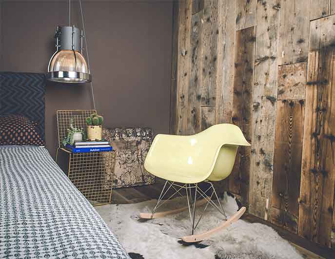
Voga is a british eecommerce website selling scandinavian designers furnitures.
- Increase the sales
- Sharing my knowledges and some new ideas.
- Lead the design team and organised the general planning
Idea
- Create a design by following my clients' specific demands.
- Propose new ideas to increase the sales by changing the over all design and simplify the procedure of the checkout pages.
Technologies
- HTML
- CSS
- Photoshop
- Illustrator
- Javascript
Chart color
-
#e45e48
-
#000000
Responsive
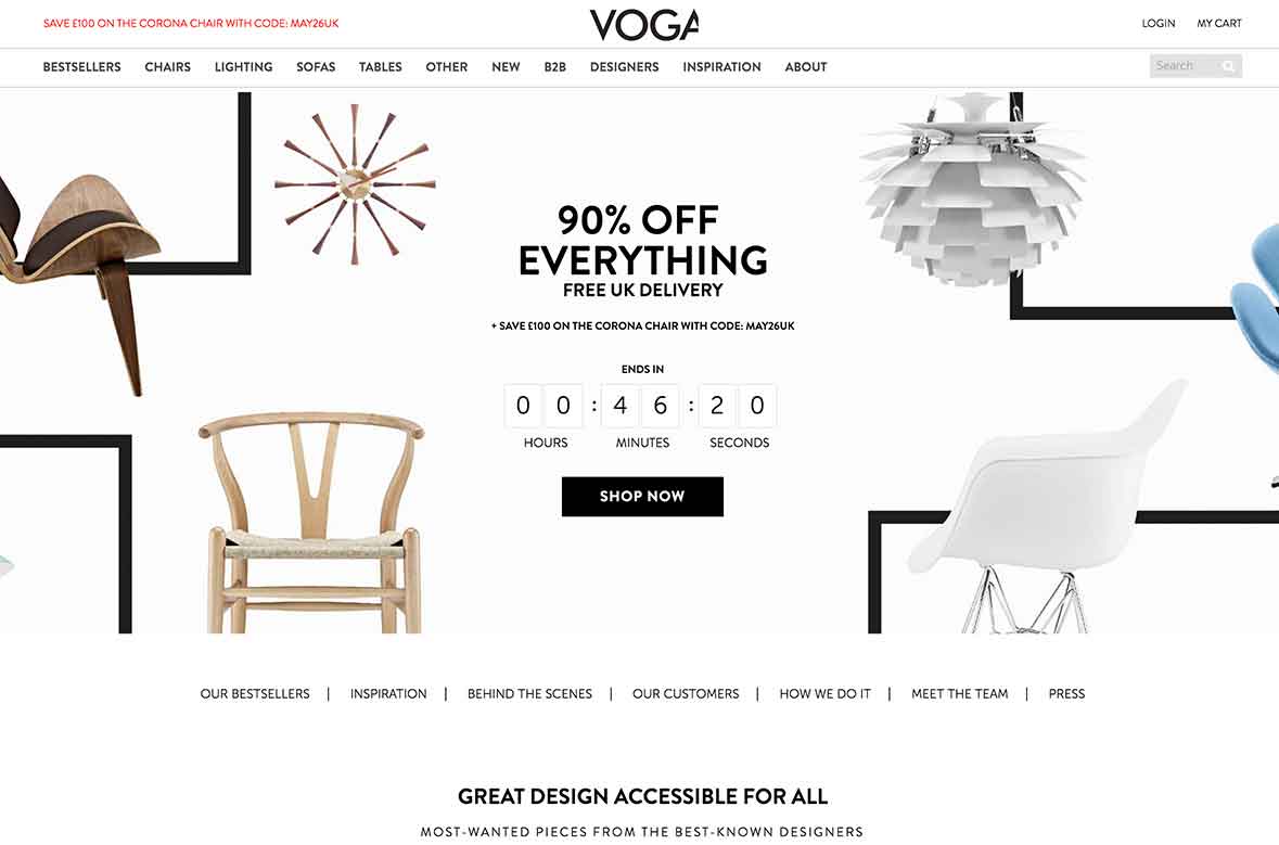
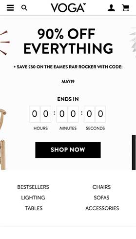
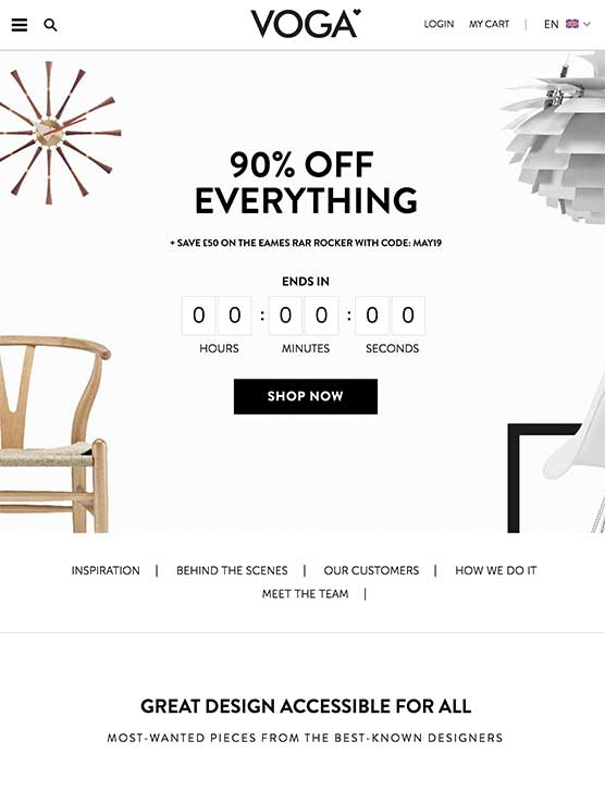
The adaptation for small devices is very important for increasing the sales.
UX
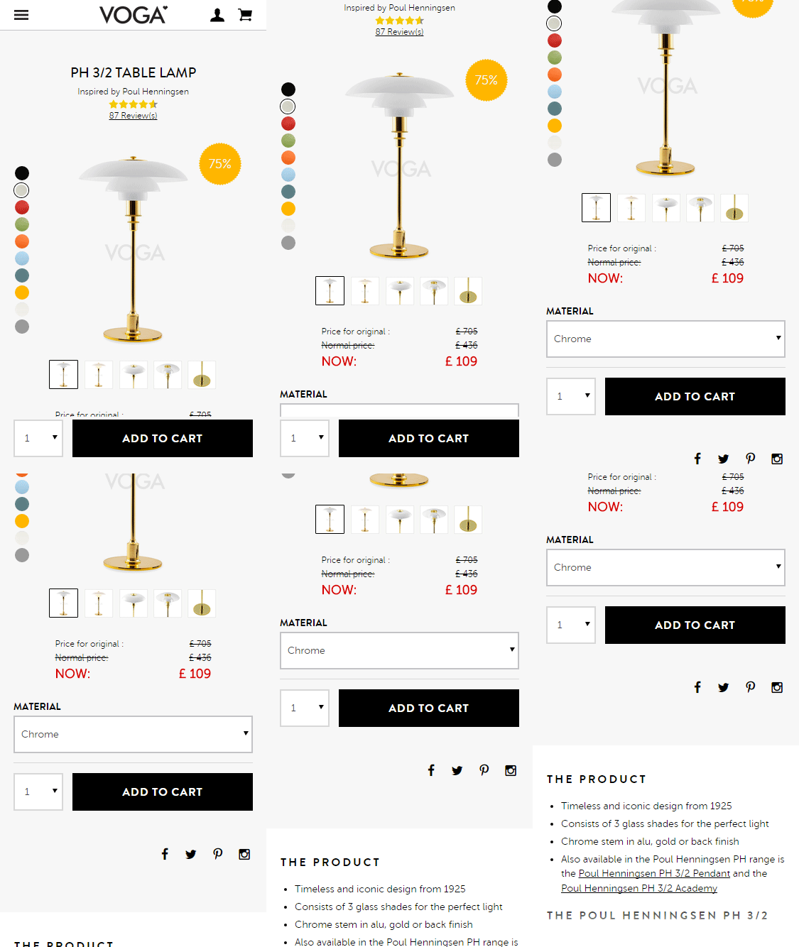
Constantly we brainstormed and tested out numerous methods to improve the UX.
The hard part was to constantly be sure of our propositions was the best and proved it by testings.
Cf Image: This was a proposition about the product page on mobile device, the proposition was to reserve the possibility for the customers to make direct purchase without scrolling the page.
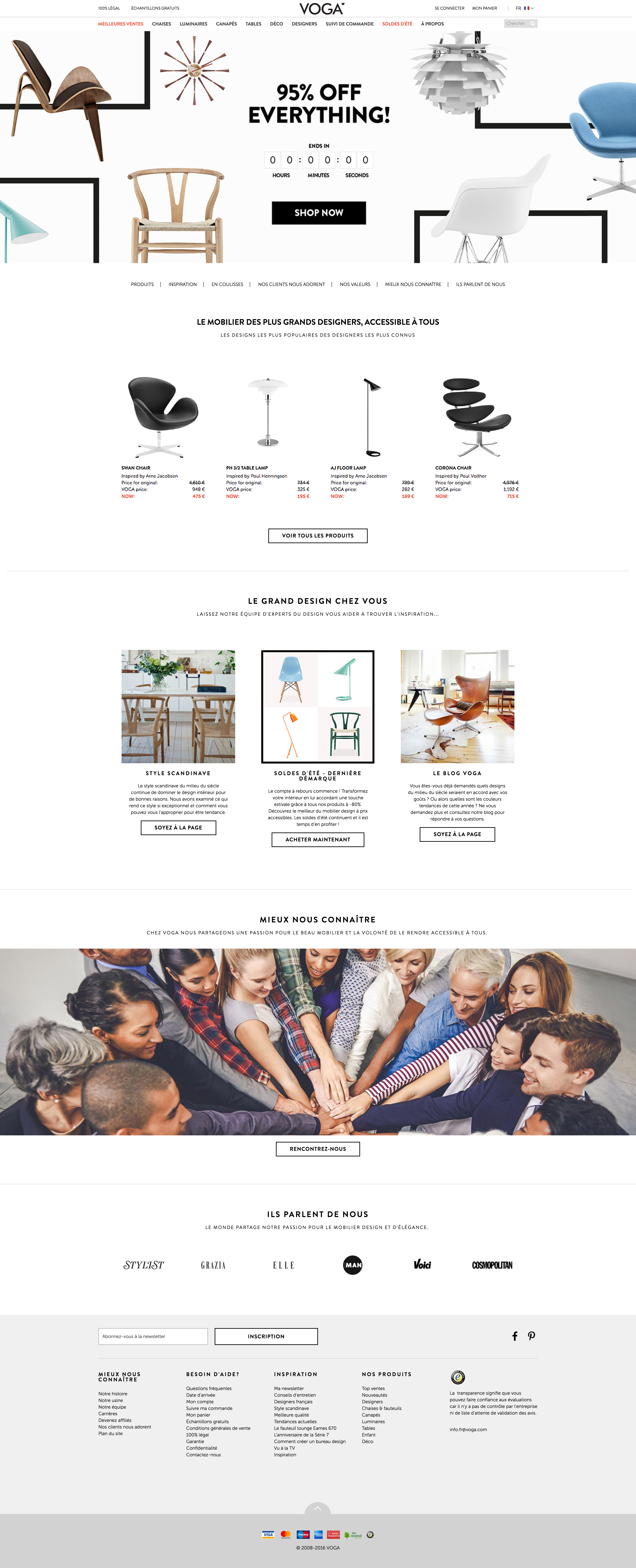
Home page

Product page
After few tests on the product page, my team concluded that the color of the call-to-action button should be green. The result after that changes got the expected effect.

- Art directorPosition
- CBS interactiveClient
- Photoshop / HTML / CSSTechnologie
Brief
Gamekult is a video gaming website that provides news, reviews, previews, downloads, and other information on video games.
- Creating banners ads.
- Managing small scale teamwork.
- Maintenance of the front-end part
- Creating mini website for game contest
- Giving ideas for new features / designs
- Creating Newsletters / emailings (B2B and B2C)

Idea
Being constantly vigilant, making daily check on the website.
Trying to improve the emailing experience of our customers, we rule out the negative possibilities, keeping the idea with the best convertion rate and trying to improve it.
Technologies
- HTML
- CSS
- Photoshop
- Illustrator
- Flash
- Animate
- Javascript
Chart color
-
#dc5b28
-
#edaf01
-
#282828
-
#dddddc
Partners page
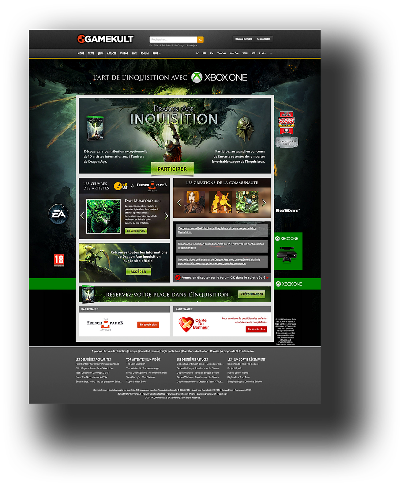
Game contest for a partner Microsoft focusing on the game called "Dragon edge Inquisition".
Banners
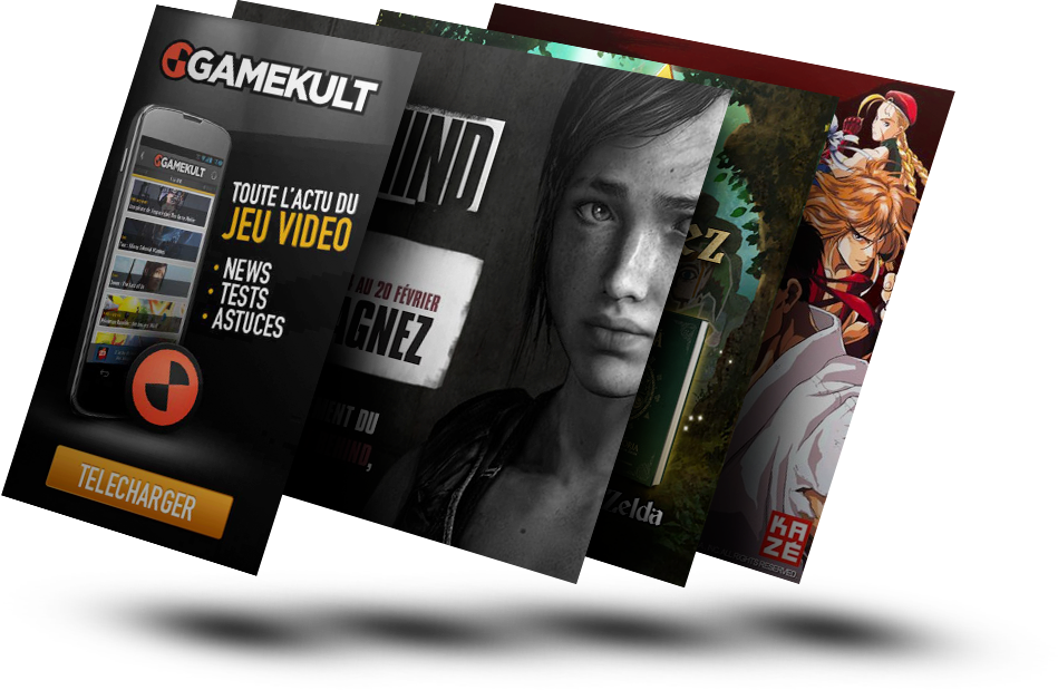
I got the opportunity to work on fixed and animate banners made in HTML/CSS or FLASH, and some banners are made specially for mobile devices.
ANDRé INACIO Digital Art director
Design
Code
Hi, I'm a Digital art director from France living in London, where I work as a digital art director. With a background in Webdesign, Front-End, advertisement and management on leading and helping the design teams, my strength lies in website and app design.
If you want to know more about my work or me, else if you want to offer me the salary of Neymar, feel free to contact me at andreinacio.design@gmail.com.
Here is my resume for getting more details from my work experience.
Knowledges
- Figma
- Sketch
- Adobe XD
- Invision
- Photoshop CC
- Illustrator CC
- Principle
- Procreate
- HTML 5
- CSS 3
- Maqento
- LESS
- Smarty
- Bash
- Jquery
- Wordpress
- Ez Publish
- Animate CC
- Php storm
- Asana
- Jira
- RealTimeBoard
- Indesign
Key words
- UI/UX design
- Brand design
- Design Thinking
- Atomic Design
- Responsive
- Design Workshops
- Prototyping
- Design System
- Interaction Design
- Bootstrap
- Zonning
- Wireframe
- Draft
- Animation
- Ergonomic
- Storyboard
- Layout
- Logotype
- Graphic Chart
- Pictogram
- Iconography
- Video
- Vector Illustration
Languages
- French (Mother tongue)
- English (fluent)
- Portuguese (Advanced)
- Spanish (Elementary)
